This guide walks you through building a responsive WordPress theme from the ground up. You’ll learn essential coding practices, mobile-first design, and how to ensure your theme works beautifully on all devices.
Key Takeaways
- Start with a solid foundation: Use a basic theme structure and include essential files like style.css and index.php.
- Use mobile-first CSS: Design for small screens first, then enhance for larger devices using media queries.
- Leverage WordPress template hierarchy: Understand which files control different parts of your site for better customization.
- Make navigation accessible: Ensure menus work on touch devices and are keyboard-friendly.
- Test across devices: Use browser tools and real devices to verify responsiveness.
- Optimize performance: Minimize CSS, use efficient images, and avoid heavy scripts for faster loading.
- Follow WordPress coding standards: Write clean, secure code that integrates smoothly with the platform.
How to Build a Responsive WordPress Theme
Building a responsive WordPress theme might sound intimidating, but with the right approach, it’s totally doable—even if you’re new to theme development. A responsive theme automatically adjusts its layout to look great on phones, tablets, and desktops. In this guide, you’ll learn how to create a custom, mobile-friendly WordPress theme from scratch using HTML, CSS, PHP, and best practices.
By the end, you’ll have a fully functional, responsive theme that you can customize further or use as a foundation for future projects. Let’s dive in!
Step 1: Set Up Your Development Environment
Before writing code, make sure your environment is ready. You’ll need:
- A local server (like XAMPP, MAMP, or Local by Flywheel)
- A code editor (such as VS Code or Sublime Text)
- WordPress installed locally
Create Your Theme Folder
Navigate to wp-content/themes/ in your WordPress installation. Create a new folder for your theme—name it something simple like my-responsive-theme.
Add Required Theme Files
Every WordPress theme needs at least two files:
- style.css – Contains theme metadata and CSS styles.
- index.php – The main template file.
In style.css, add the following header:
/*
Theme Name: My Responsive Theme
Theme URI: https://example.com/my-responsive-theme
Author: Your Name
Author URI: https://example.com
Description: A clean, responsive WordPress theme built from scratch.
Version: 1.0
License: GNU General Public License v2 or later
Text Domain: my-responsive-theme
*/
This tells WordPress your theme exists. Save the file and refresh your WordPress admin. You should now see your theme under Appearance > Themes.
Step 2: Build the Basic Theme Structure
Now, let’s add the core template files to control different parts of your site.
Create header.php and footer.php
These files contain reusable code for the top and bottom of your site.
In header.php:
>


>
In footer.php:
Update index.php
Now, modify index.php to include the header and footer:
>
This displays a list of blog posts with titles and excerpts. The get_header() and get_footer() functions pull in your reusable templates.
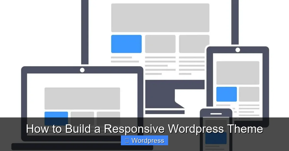
Visual guide about How to Build a Responsive WordPress Theme
Image source: visualmodo.com
Step 3: Add Responsive CSS
Now comes the fun part—making your theme look great on all devices. We’ll use mobile-first CSS, meaning we start with styles for small screens and add enhancements for larger ones.
Basic Reset and Layout
Add this to your style.css:
* {
  margin: 0;
  padding: 0;
  box-sizing: border-box;
}

body {
  font-family: 'Arial', sans-serif;
  line-height: 1.6;
  color: #333;
  background: #fff;
}

.site-header, .site-footer {
  background: #2c3e50;
  color: #fff;
  padding: 1rem;
  text-align: center;
}

.site-main {
  padding: 1rem;
  max-width: 800px;
  margin: 0 auto;
}

article {
  margin-bottom: 2rem;
  padding: 1rem;
  border-bottom: 1px solid #eee;
}

h1, h2 {
  margin-bottom: 0.5rem;
}

a {
  color: #3498db;
  text-decoration: none;
}

a:hover {
  text-decoration: underline;
}
Add Media Queries for Larger Screens
Now, enhance the layout for tablets and desktops:
@media (min-width: 768px) {
  .site-header, .site-footer {
    padding: 2rem;
  }

  .site-main {
    padding: 2rem;
  }

  article {
    padding: 1.5rem;
  }

  h1 {
    font-size: 2.5rem;
  }

  h2 {
    font-size: 1.8rem;
  }
}

@media (min-width: 1024px) {
  body {
    font-size: 18px;
  }

  .site-main {
    max-width: 1000px;
  }
}
These media queries adjust padding, font sizes, and layout as the screen gets wider. The min-width approach ensures mobile devices get the simplest, fastest version first.
Step 4: Make Navigation Responsive
A responsive menu is crucial for usability. Let’s add a simple navigation bar that collapses on mobile.
Add a Menu in header.php
Update your header.php to include a navigation area:
Register the Menu in functions.php
Create a new file called functions.php in your theme folder and add:
 __('Primary Menu', 'my-responsive-theme')
  ));
}
add_action('after_setup_theme', 'mytheme_setup');
?>
Now go to Appearance > Menus in WordPress and create a menu, then assign it to the “Primary Menu” location.
Style the Navigation Responsively
Add this CSS:
.main-nav {
  background: #34495e;
  padding: 0.5rem 0;
}

.nav-menu {
  list-style: none;
  display: flex;
  justify-content: center;
  flex-wrap: wrap;
}

.nav-menu li {
  margin: 0 1rem;
}

.nav-menu a {
  color: #fff;
  padding: 0.5rem;
  display: block;
}

@media (max-width: 767px) {
  .nav-menu {
    flex-direction: column;
    align-items: center;
  }

  .nav-menu li {
    margin: 0.5rem 0;
  }
}
On small screens, the menu stacks vertically. On larger screens, it displays horizontally.
Step 5: Test and Troubleshoot
Your theme is taking shape! Now it’s time to test it across devices.
Use Browser Developer Tools
Open your site in Chrome or Firefox and press F12 to open developer tools. Use the device toolbar to simulate phones, tablets, and desktops. Check for layout issues, text overflow, or broken menus.
Test on Real Devices
Nothing beats real-world testing. Load your site on an actual phone and tablet. Pay attention to:
- Touch targets (buttons and links should be easy to tap)
- Text readability (no tiny fonts)
- Loading speed (especially on slow connections)
Common Issues and Fixes
- Images not scaling: Add
img { max-width: 100%; height: auto; }to your CSS. - Horizontal scrolling: Check for fixed widths or padding that pushes content outside the viewport.
- Menu not appearing: Ensure the menu is assigned in WordPress and the theme location matches.
Step 6: Enhance and Optimize
Once your theme is responsive, consider these improvements:
Add a Responsive Sidebar (Optional)
Create sidebar.php and include it in your layout using get_sidebar();. Style it to stack below content on mobile.
Optimize for Performance
- Minify your CSS and JavaScript.
- Use compressed images (JPEG for photos, PNG for graphics).
- Avoid heavy frameworks unless necessary.
Include Accessibility Features
- Use semantic HTML (
<header>,<main>,<footer>). - Add ARIA labels if needed.
- Ensure good color contrast.
Conclusion
Congratulations! You’ve built a responsive WordPress theme from scratch. You now understand the core structure, how to use CSS media queries, and how to make your site work beautifully on any device. This foundation can be expanded with more templates (like single.php for individual posts or page.php for static pages), custom widgets, or even a theme options panel.
Remember, responsive design isn’t a one-time task—it’s an ongoing process of testing and refining. Keep your code clean, stay updated with best practices, and your themes will serve users well for years to come.